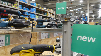
The prototype with the innovative features was launched at Almelo in the Netherlands. This is a Praxis store to which a new standard spatial concept has been applied. In concrete terms it involves three points: a new labelling system inside the DIY store, more efficient merchandising (including expansion of the decorating side following the Megapraxis format, together with the relaunch of interior design segments) and the introduction of electronics to the DIY store.
According to a survey by Q & A Research & Consultancy, around three-quarters of customers in the DIY sector have difficulty in tracking down the right product. Newly available for customers’ use is a computer listing all the articles stocked in the store. Having entered the appropriate search word, the user is quickly informed exactly where the product is located in the store. What is more, he can print out a floor plan if necessary. All entries are saved, and where there is repeated use of words that the computer fails to recognise, they are added to the search inventory.
Yet another new introduction is a digital colour consultant, which helps customers to find exactly the right shade of paint. Another function is as an advisory service for certain home improvement jobs. For example, if you have a rusty grating that requires some work, the computer has the right answer: it will tell you how to do it, what products you need and where you can find them in the store. There is also a computer installed at the Info desk, where you can find DIY magazines as well, and a member of staff is available to help customers with their problems.
On the floor you can see areas and lines marked in dark grey. These markings are intended to show shop assistants where exactly to position special offers and seasonal articles within the store, and they also mark out the boundaries so that customers can move through the store without running into any obstacles.
The aisles no longer stick to the standard width of 1.40 m throughout. In fact, wherever possible there are variations in width. This means that, although the “paint aisle” is theoretically only 1.20 m across, the racking is higher and shallower, so an actual width of 1.50 m is achieved, which makes the space seem bigger.
The lighting department has also been designed more three-dimensionally to make the segment more effective. What is more, it is working with “synchro switching”, whereby the lights are only on for about a third of the time that was…

 Menü
Menü


 Newsletter