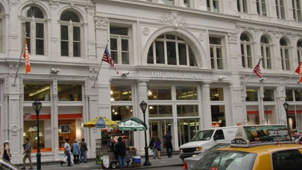
Criticism of the layout of the new Home Depot outlet in Manhattan is not positive in every respect. Points that are meeting with a negative response from customers include low ceilings in some places and many narrow aisles. Overall, though, it must be said that management has geared the store entirely to the requirements of the urban population. Housed in a historic white building, from the outside the outlet is relatively low-key in appearance and makes only very economical use of the bright orange brand logo.
You can find a report on first impressions from Manhattan under the Trade Topics section of DIYplus (v. Other Articles on this Topic as well).

